Captain Marvel Sales Nosedive
No surprise here, as the comic book sales for the latest Captain Marvel relaunch, released in conjunction with the new…
Follow the latest comic book news, including Marvel, DC, Image, Dark Horse, new releases, creator updates, previews, reviews, rumors, and comic industry coverage.
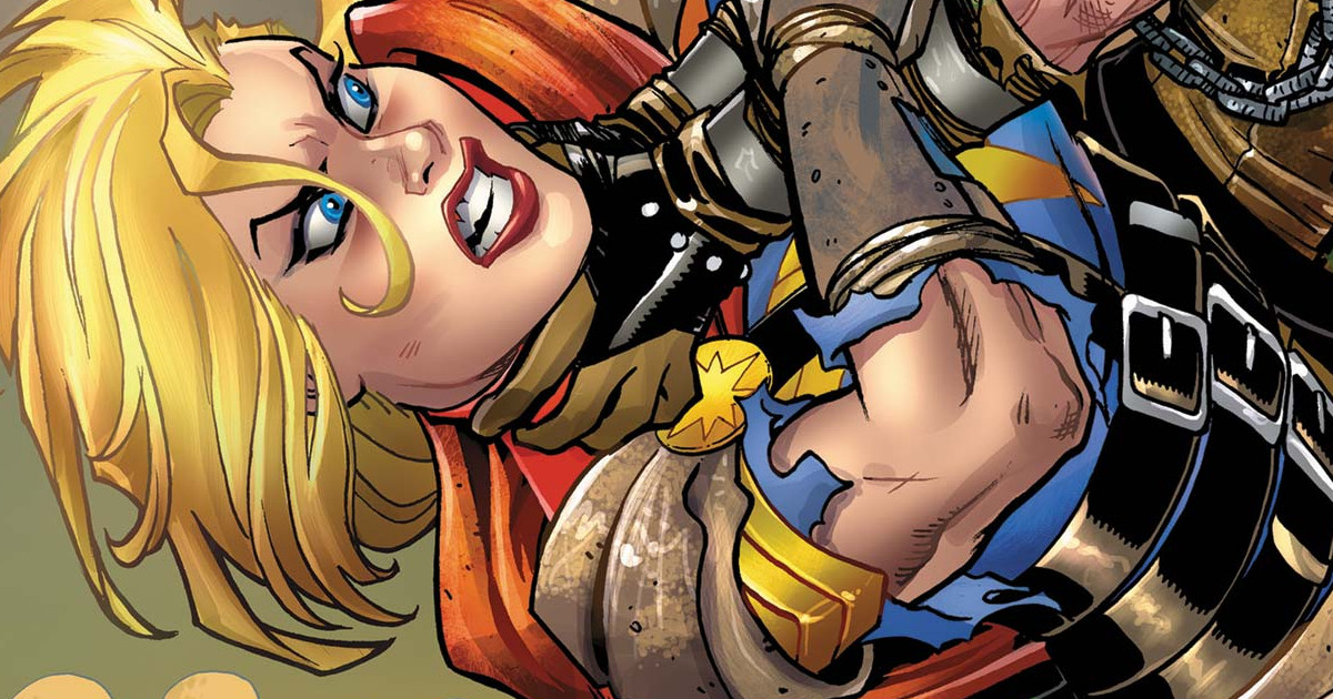
No surprise here, as the comic book sales for the latest Captain Marvel relaunch, released in conjunction with the new…
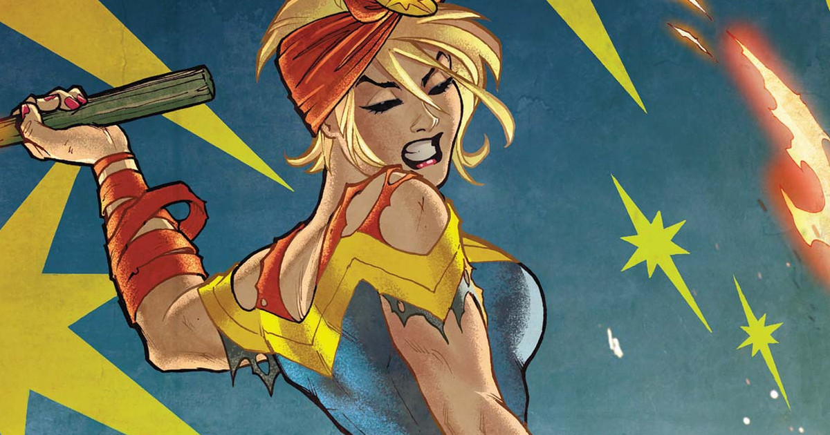
Prior to the release of the movie, Kevin Feige went on record stating Captain Marvel is one of the most

A Review Of Guardians of the Galaxy #4 (of 6) Writer: Cates Artist: Shaw Colorist: Curiel Cover Artists: Marquez &
Prior to the release of the Captain Marvel movie, Marvel Studios president Kevin Feige took a page out of Disney’s

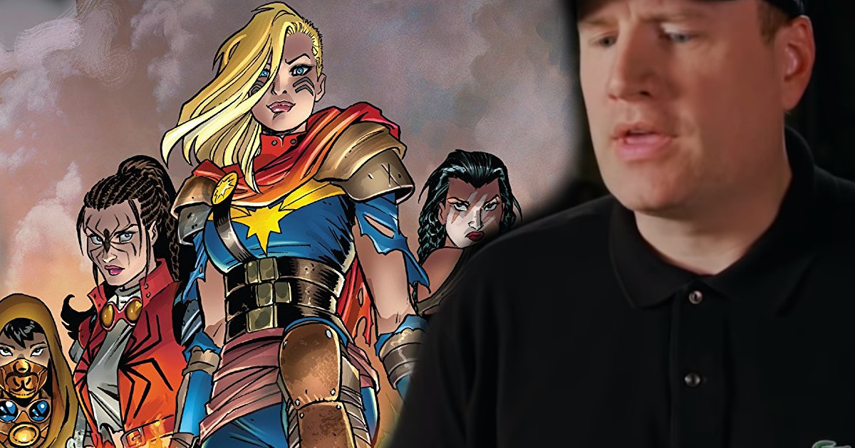
At the recent C2E2 convention, Marvel Comics announced a bunch of new events including War of the Realms, two new

A Review Of Guardians of the Galaxy #3 of 6 Writer: Cates Artist: Shaw Colorist: Gracia Cover Artists: Marquez &
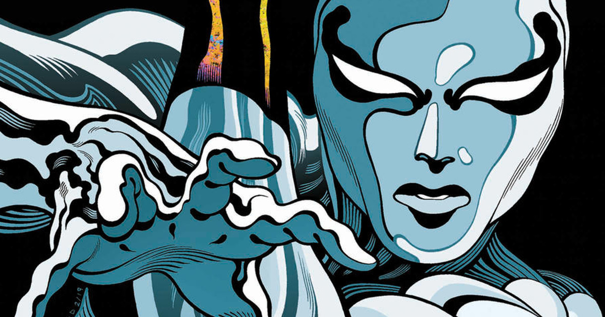
From Donny Cates, the writer of Cosmic Ghost Rider and the current Guardians of the Galaxy, comes Silver Surfer: Black, with
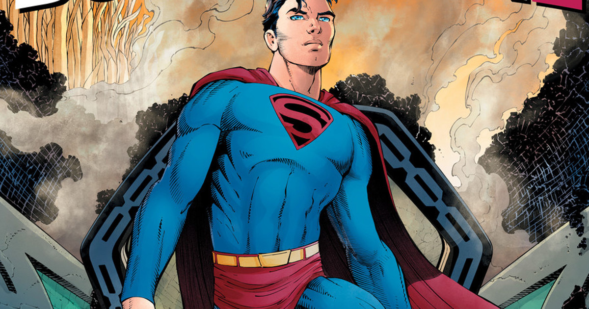
DC Comics announces the Man of Steel is getting the year one treatment with Superman: Year One from Frank Miller
With DC Comics in trouble, Marvel Comics in trouble, and the industry said to be in shambles, now it is

A Review Of The Black Order #5 of 5 by Timelord Writer: Derek Landy Penciler: Carlos Magno Inker: Scott Hanna Colorist: